
I mentioned before that I'd traced some Ottobre patterns and by the time I got around to cutting them out, he'd grown enough that they wouldn't fit for long. I figured this out by cutting out the shirt you see above. This is the #12 shirt from the 4/2010 issue. I'd traced and cut it out in a 92 and sewed it up, only to discover that T. had grown enough for it to be rather snug on him. The shirt is supposed to look like two in one, with the hood in a contrasting fabric, so I dug up some brown and red Campan knit from a previous shirt I'd made him and used that for the hood. I'd already used olive green ribbing because it goes so well with the Ooga print but it didn't look good with the brown and red, so I went with the maroon ribbing on the hood. It definitely gives the impression of two different shirts, although it's obvious from the fit that it's just one.
 border="0"alt=""id="BLOGGER_PHOTO_ID_5719466894329964178" />
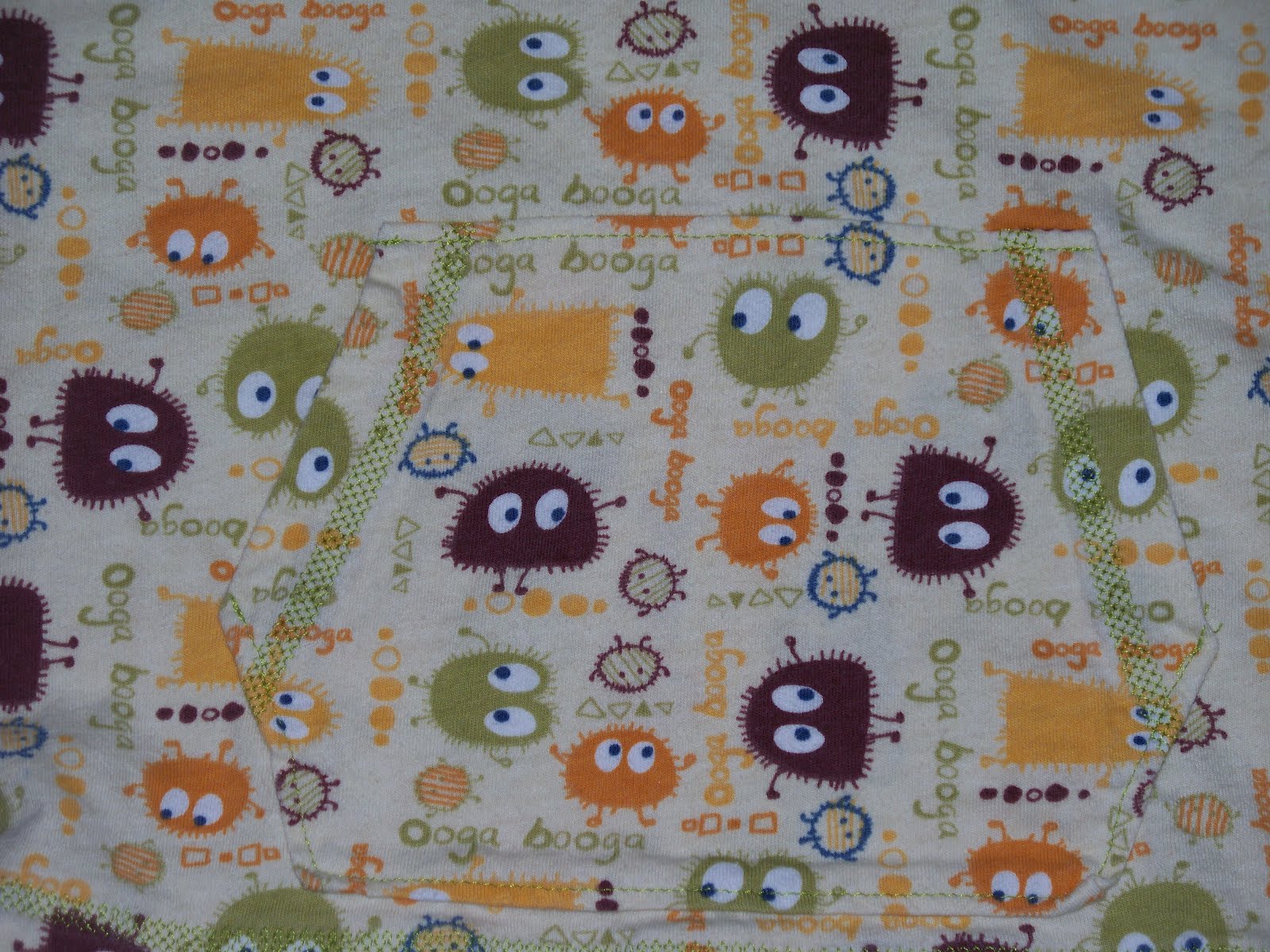
Here you can see the front pocket a bit better, although it still blends into the body of the shirt. I used the triple-honeycomb stitch on my machine to imitate a RTW coverstitch. Anyway, it works well and I used the same stitch when I made the drawstrings for the sweatpants in the previous post.
Having realized that the boy needed a 98, I cut out new sizes for him in 2 other shirts. The first is the Hippotamus Hoppulainen shirt from the 6/2010 issue. I like this shirt because I think it lends itself to a mix of fabrics while still looking sporty and boyish. For this I used the Michael Miller dinosaur interlock and a piece of orange and red Campan knit. That Michael Miller stuff shrinks like nobody's business and it's super soft! Maybe that's why it shrinks so? Anyway, the ribbing is a beautiful turquoise from JoAnn's. I wish it were slightly more green in color but I like the contrast of the turquoise with the orange.

This piece of Campan was really small - not even a half meter, so I had to really work to fit all the pieces when I laid it out. As you can see, I used the stripe for the front, back and the stripes on the sleeves. This shirt goes really well with the brown sweatpants in the previous post.

Last shirt in the list is the Pistachio-Chocolate reversible hoodie from the 4/2009 issue. I wanted something to match the blue sweatpants and dug out a printed stripe knit that I'd used for outfits for the girls about 4 years ago. I'd used it for an accent to a print, but it seemed like a good boy fabric. Then I dug around in my stash and found the world's softest navy cotton knit this side of paradise - totally serious about this. I want to curl up in it. Anyway, add to that some olive green interlock and some maroon ribbing and you get this:


I decided that I wanted the pocket and hood on the stripe side to match - hence the decision to do both in green. I used that tripe-honeycomb stitch again for the pocket hems and as topstitching on the sleeve hems. The navy side would have been too plain with a navy hood, hence the stripe. T. loves this shirt and wears it a lot with either pair of the navy "soft pants". It's his "cozy" outfit. I haven't gotten him to wear it with the navy side out - I suspect he likes the way it feels against his skin too much. But it would look fantastic on the navy side with the sleeves rolled to expose the stripe on the other side. This shirt is pretty heavy and he gets hot pretty easily, so I don't have him wear a shirt under it, though you could if you used thinner knits, as it's cut quite roomy. My only problem with this shirt is that I forgot how much the stripe fades, since it's not yarn-dyed but printed. Ugh. But he doesn't seem to mind and it gives it a sort of worn-in look that is generally achieved in RTW with acid washes and the like.
No comments:
Post a Comment